Case Study: This Is Me Trying
Exploring Typographic Poster Creation and Riso Printing
Poster and Zine Design
Case Study: Exploring Typographic Poster Creation and Riso Printing
Introduction
When I started the typography project involving quote posters and Riso prints, I was scared. My previous attempt at a typographic poster didn’t go well, and the thought of using the Riso machine was intimidating. However, through perseverance and exploration, the project turned into a journey of self-discovery and creative expression.
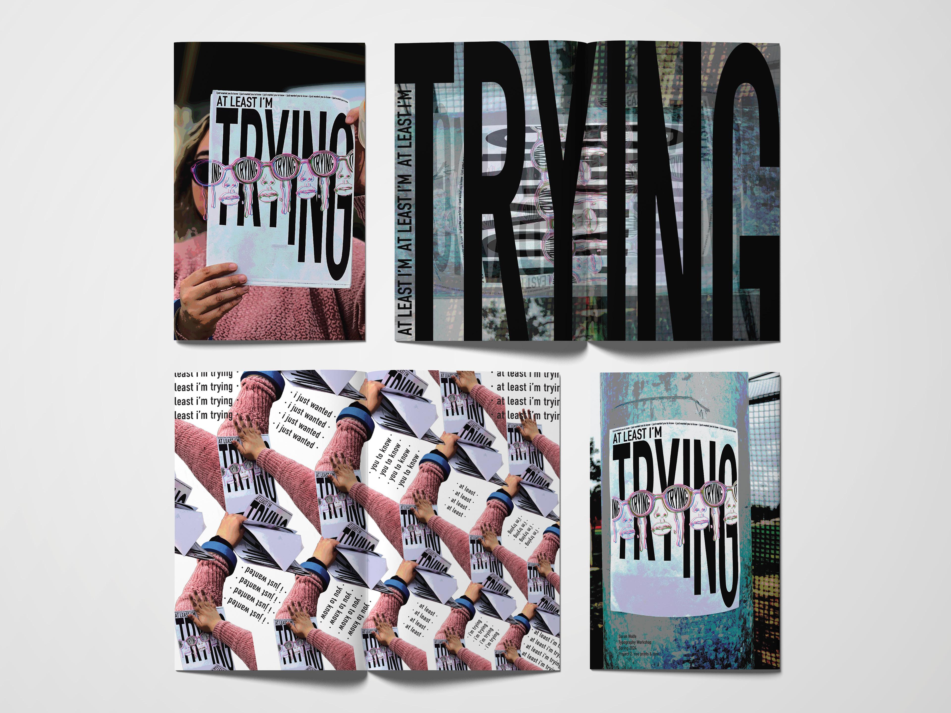
For this project, the Adobe programs I used were Illustrator, Photoshop, Lightroom, and InDesign. The poster dimensions were 8.5 x 11" and the zine dimensions were 5.5 x 8.5".
Project Objectives
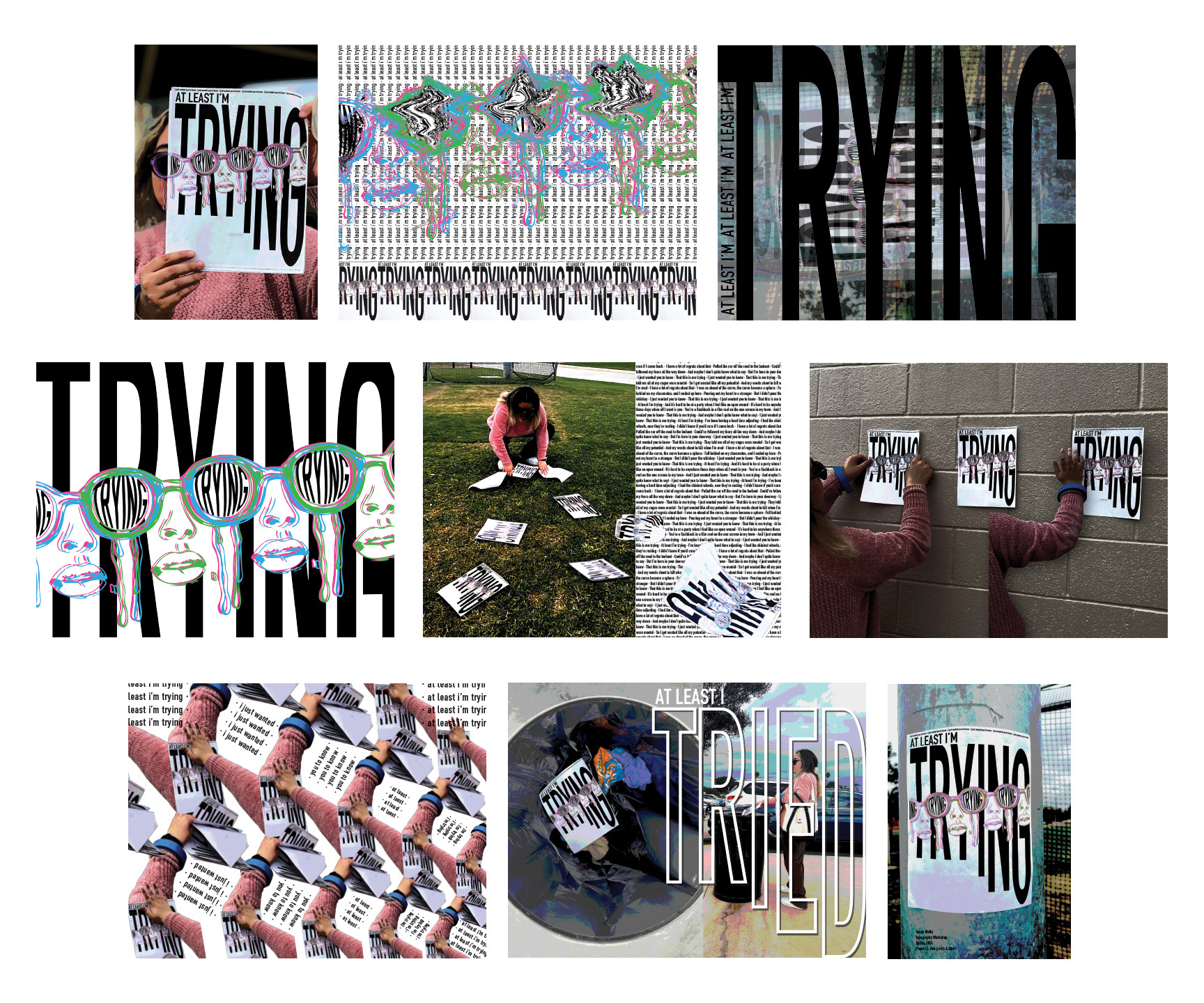
Our goal was to design a poster with a quote as the main subject, using at least three colors in Riso printing. We had to print 50 posters, hang them up in public places, and document this process with photos. The second part of the project was to create a 16-page zine that showed our design process, explained the significance of the quote, and included photos of the posters being displayed.
Initial Challenges
When starting this project, I felt scared and intimidated due to my past experiences with typographic posters and my unfamiliarity with the Riso machine. Learning to use the machine was initially daunting, but hands-on practice led to a newfound appreciation for its capabilities.
Using the machine was stressful at first. I was afraid of breaking it. Every time I printed, someone warned me to be careful, which made me even more anxious. I was overly cautious, afraid of damaging the machine. The most stressful part was printing 100 copies without knowing where to hang them.
Quote Selection
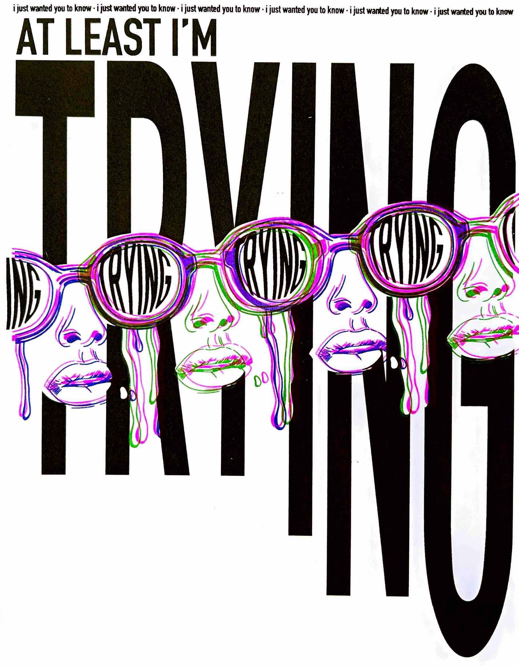
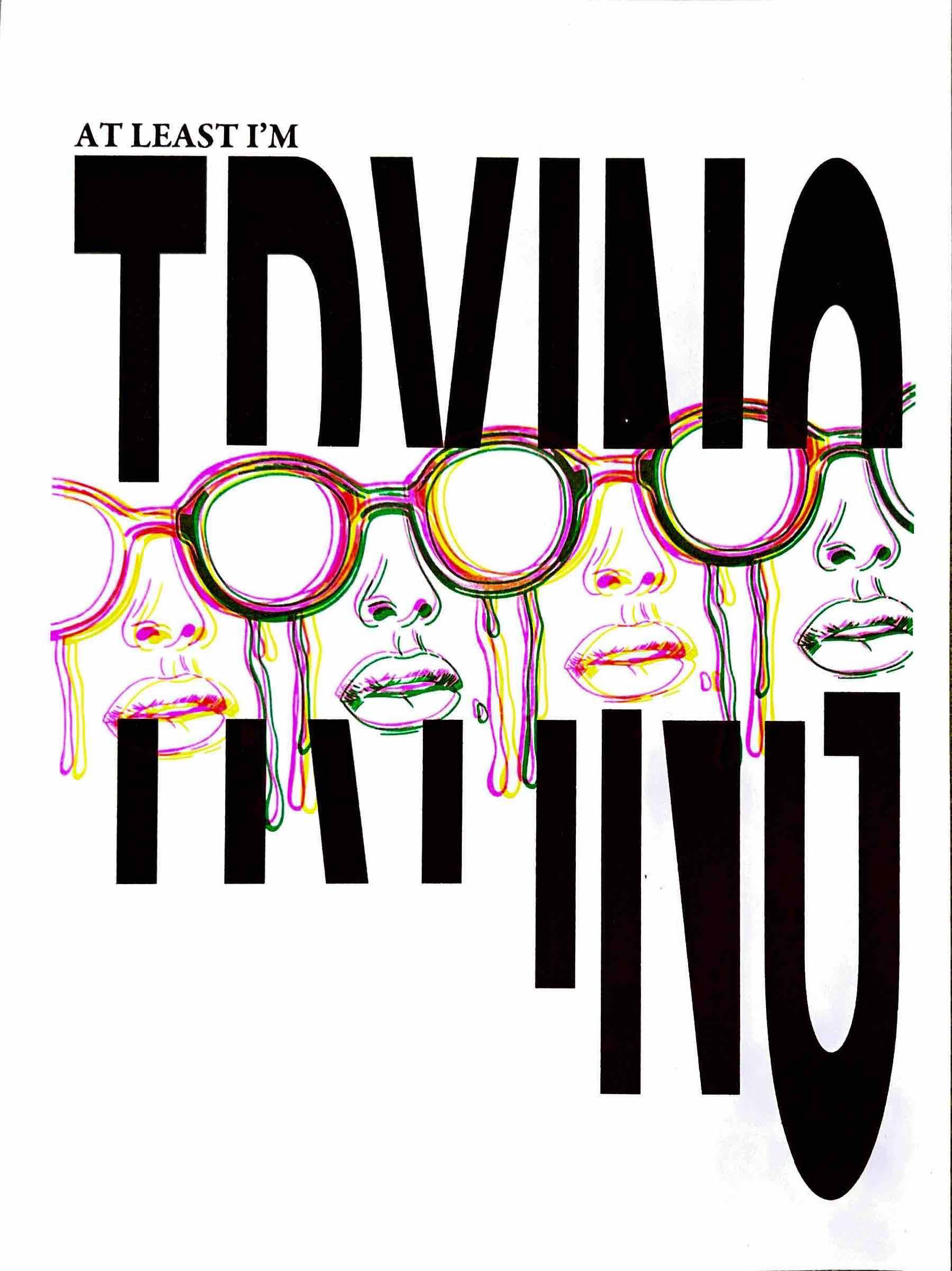
Choosing the quote was the trickiest part. After considering various sources, I settled on the quote "At Least I'm Trying" from Taylor Swift's song "This Is Me Trying." I chose this quote because it can have many different meanings for people.
For me, it reflects the challenges of my last semester of college and the pressure to finish strong. I think many seniors can relate to feeling like they're just trying to make it through. Not knowing the full meaning behind the words gives the quote more impact.
I wanted the poster to evoke emotion in the viewer, especially with the word "trying." I didn't know how each person would feel when they saw it, but I hoped they would feel understood and supported.
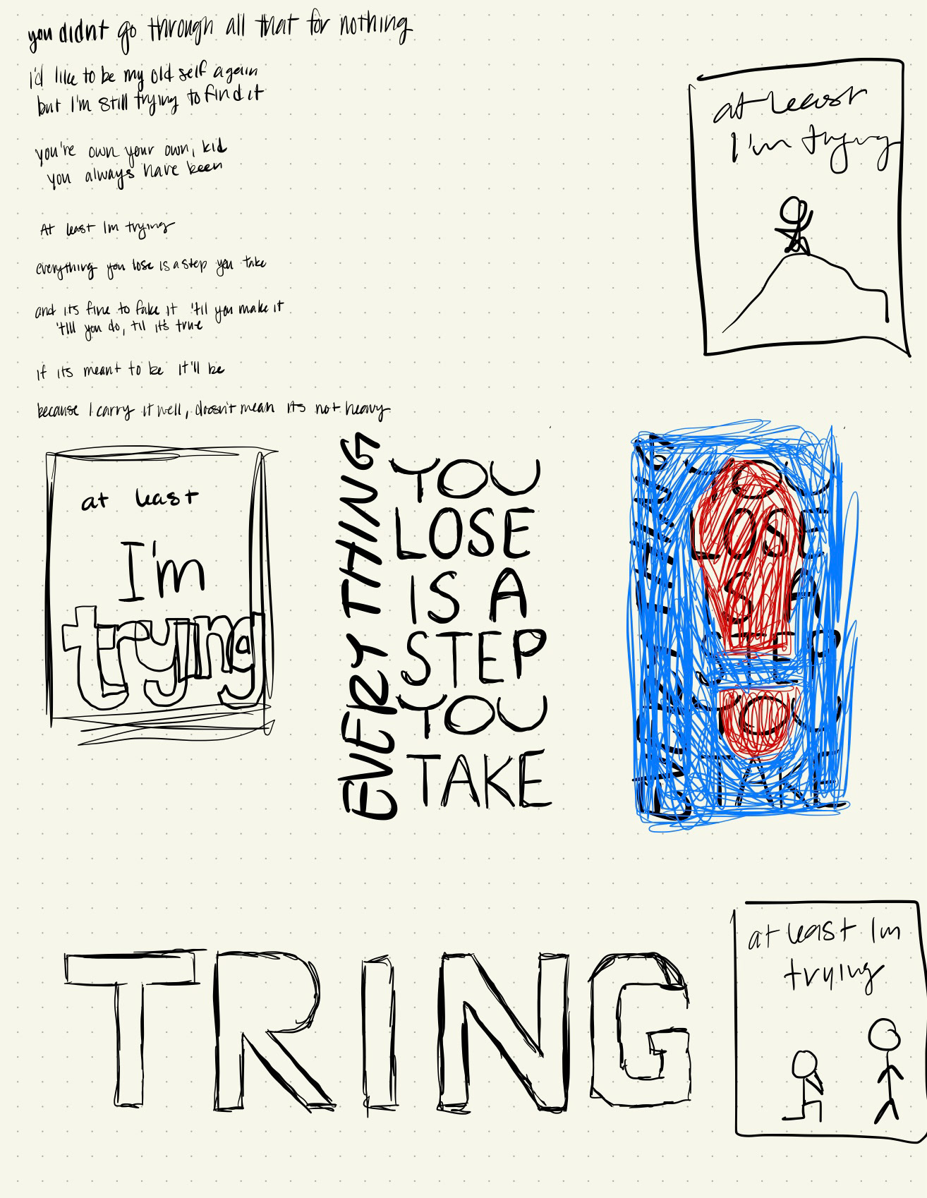
Design Process
Typography and Imagery:
• I experimented with typography in Illustrator.
• I created a vector illustration of a person wearing glasses and crying, aiming for a 3D effect.
• I ensured each design element was on separate layers for Riso printing.
Feedback and Iterations:
• I extended the word "trying" to bleed off the page.
• I added elements to match the visual rhythm.
• I decided to keep the negative space for balance.
Execution and Display
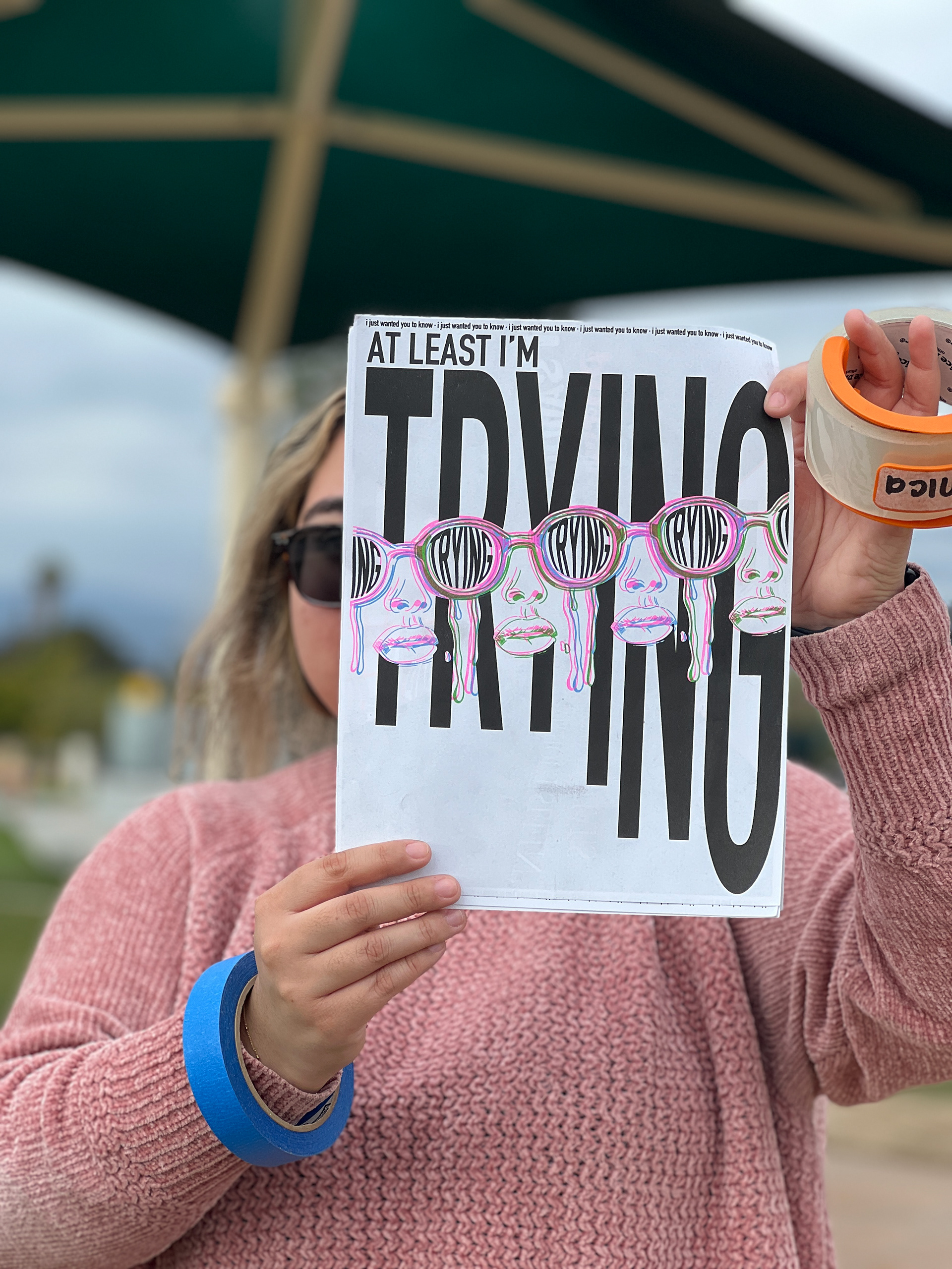
Printing 50 copies on the Riso machine was stressful, with constant caution to avoid breaking it. Initially, I considered various locations for displaying the posters, but time constraints led me to choose a local park. The park had changed significantly, and interactions with park workers made the display process challenging.
I wanted to go to downtown LA, but it wasn't feasible. So, I hung them up in my local park. I thought it would be easy, but I didn't expect so many people to be there. When I was almost done, a worker approached me and said I had to take them all down. While it was sad to see my hard work being taken down, I was able to talk about it in my zine.


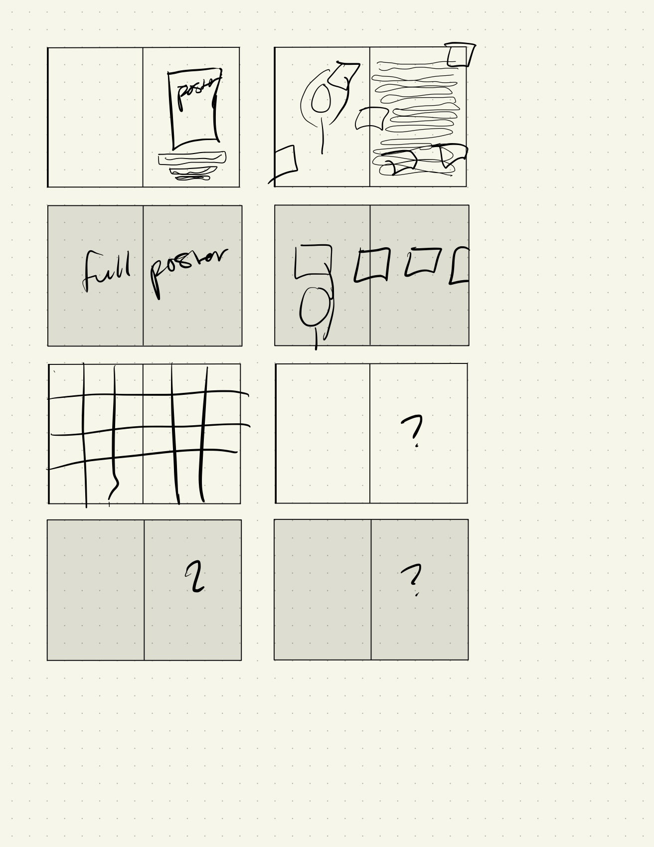
Zine Creation
For the zine, I wanted to match the poster's repetitive effect and grungy feel, reflecting the park's atmosphere. I used techniques like polarized and overexposed photos, along with rhythmic and repetitive design elements, to engage viewers and convey the narrative.
I created my zine with a lot of repetition and a grid structure, but I still wanted to be able to break the structure. When I started on this, I really tried to challenge myself through my photo editing and placement of the photos.
Conclusion
Despite the challenges, this project fostered my growth and a deeper understanding of typography and the creative process. The experience highlighted the importance of perseverance, adaptability, and embracing feedback to refine designs.
Despite being nervous about using a new machine, I enjoyed the machine. Once I figured out how to use all the colors and the machine itself, I fell in love with it. I enjoy sharing how it works and what you can create with it.
Reflecting on this project, I realize the value it added to my skill set and perspective as a designer. While some parts proved more challenging than others, each taught me something valuable about pushing boundaries and exploring new avenues in design. Looking back, I appreciate the opportunity to experiment and express myself creatively, even if some things didn't go as planned. It pushed me out of my comfort zone and encouraged me to strive for excellence in my work—a lesson I'll carry forward into future endeavors.