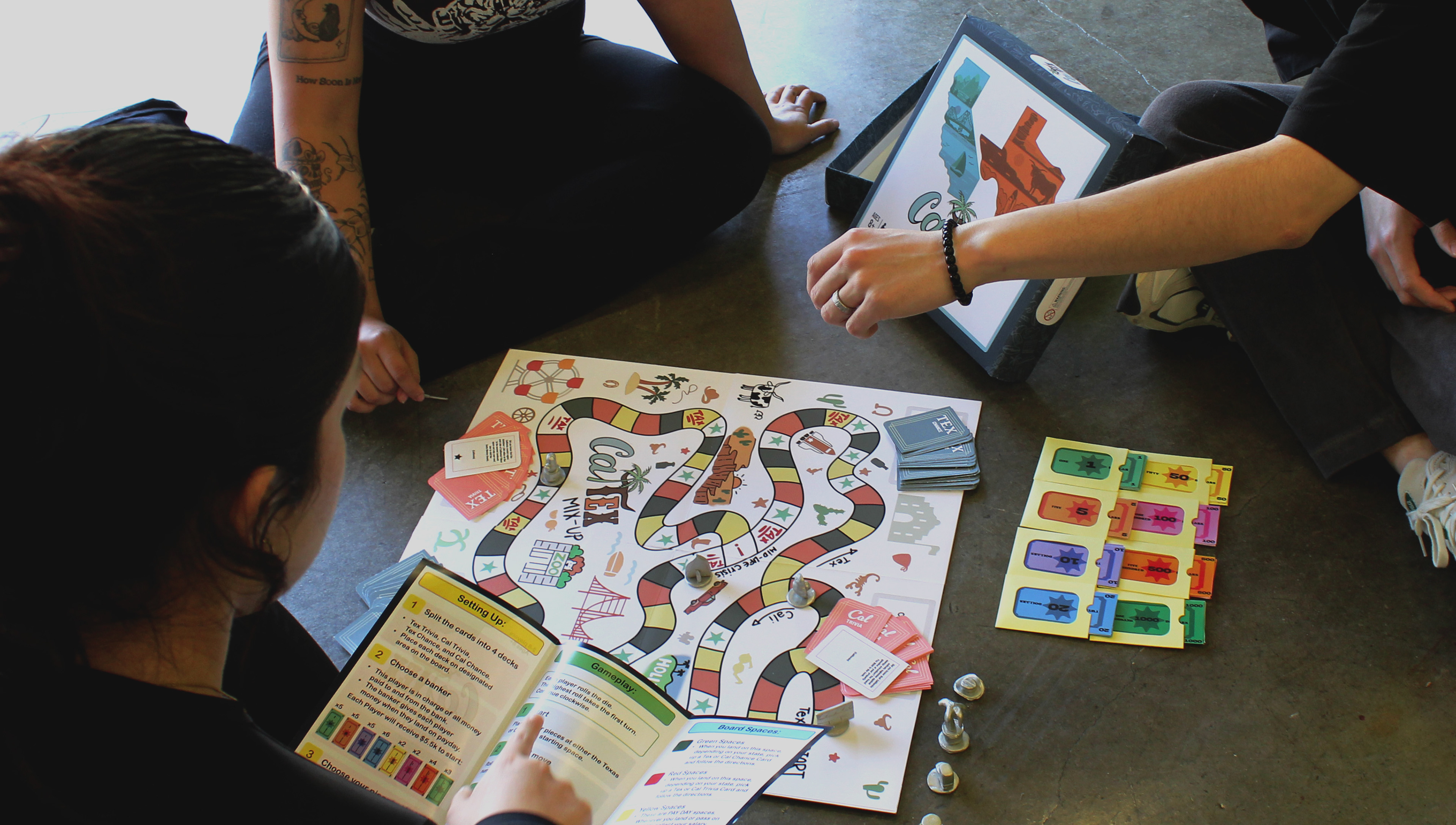
Close-up of Cal-Tex Mix-up being played by three people. One person is explaining the instructions, another is listening, and the last one is moving the pieces around.
Learn By Playing: Cal-Tex Mix-Up
Gameboard Design
Team Designers:
Amanda Torres - logo and hero image
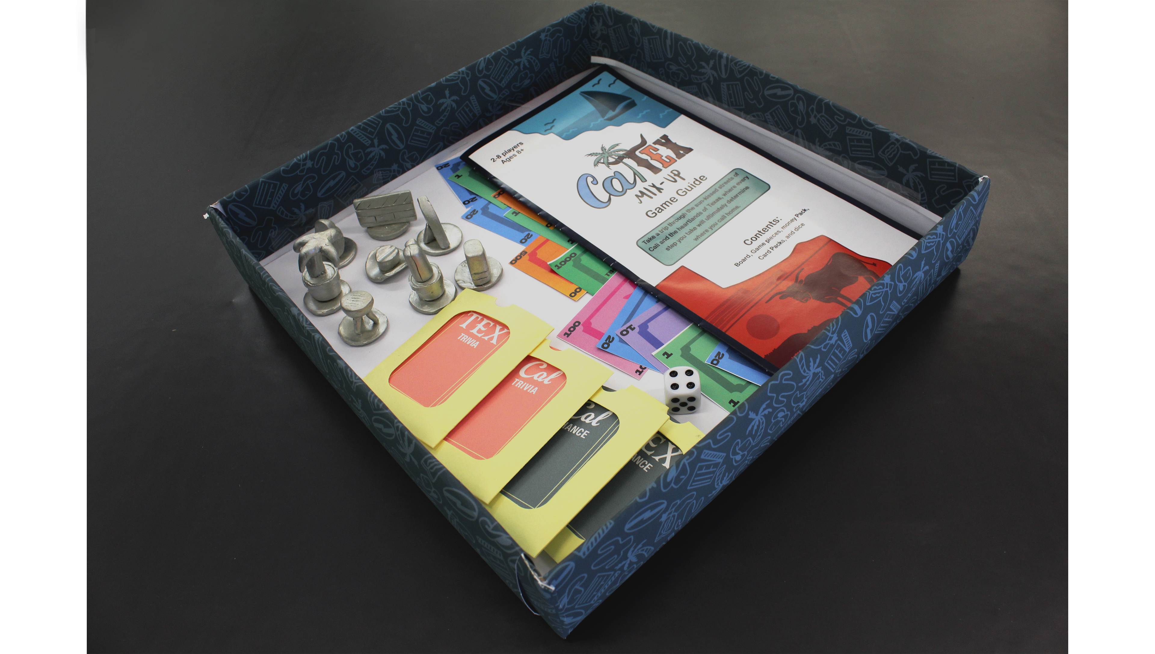
Isabelle Valmores - money and clay-made game pieces
Sarah Wolfe - chance and trivia cards, cardholders/envelopes; helped with writing instructions
Johnson Yang - game board design
Ryan Zamarripa - instructions and game box packaging design; helped with game board design and 3D rendered game pieces
Objective:
Create a game board with the topic Califonia vs. Texas living "Cal-Tex Mix-Up". The design team is responsible for content research, and all visual components to the final game mock-up. The goal is to educate the audience through playing the game.
Dimensions:
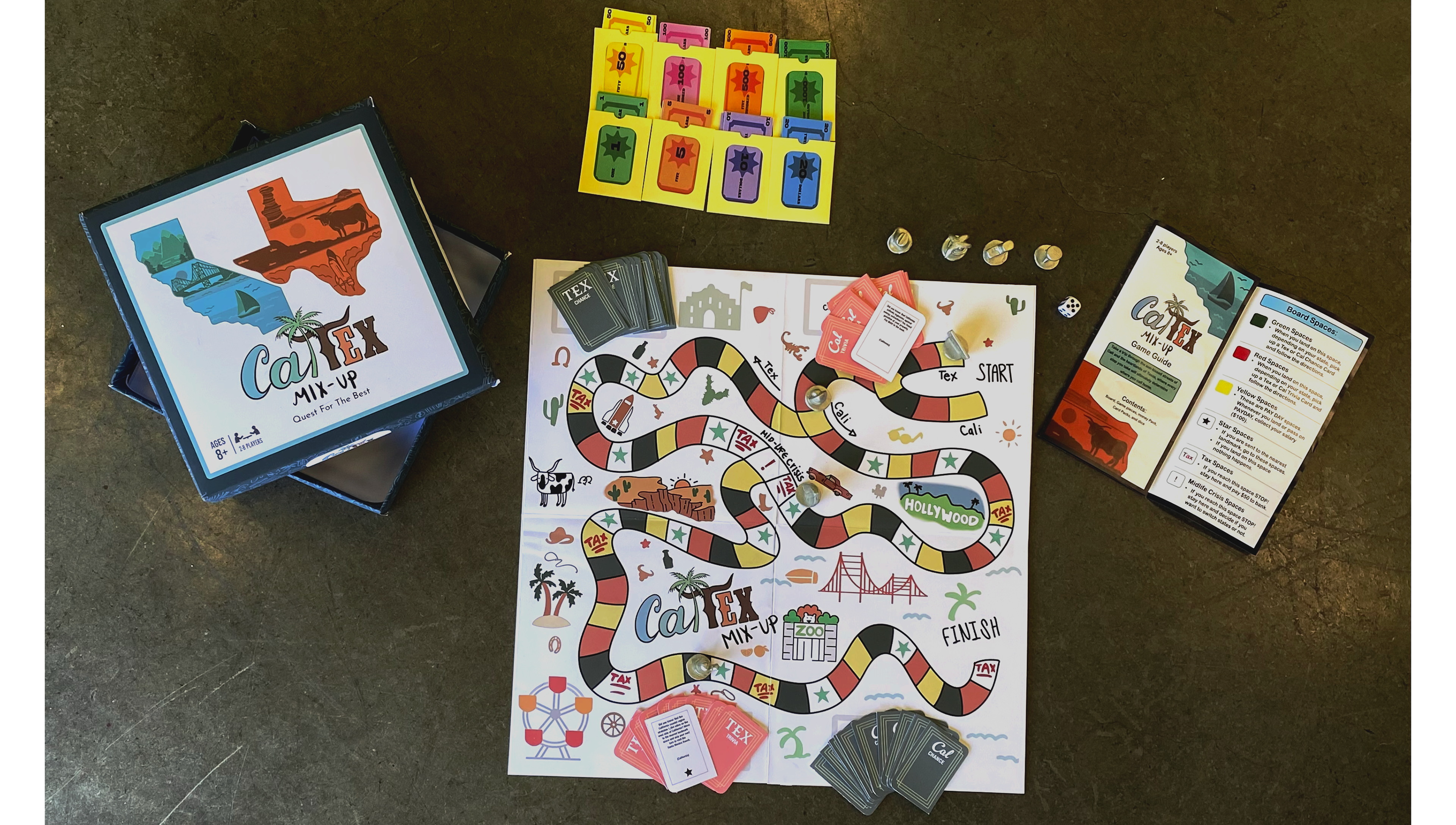
Gameboard: 20 x 20"; Game Box: 11 x 11 x 2";
Cards: 2 x 3"; Money: 4 x 2";
Cardholder/Envelopes: 2.5 x 3.25"


Design Process:
We initiated our project by brainstorming ideas surrounding the comparison of living in California versus Texas. Dividing our focus into five main areas - weather, living conditions, cost of living, policies, and entertainment - we gathered relevant information. Each of us then crafted 3 to 4 trivia statements based on our findings.
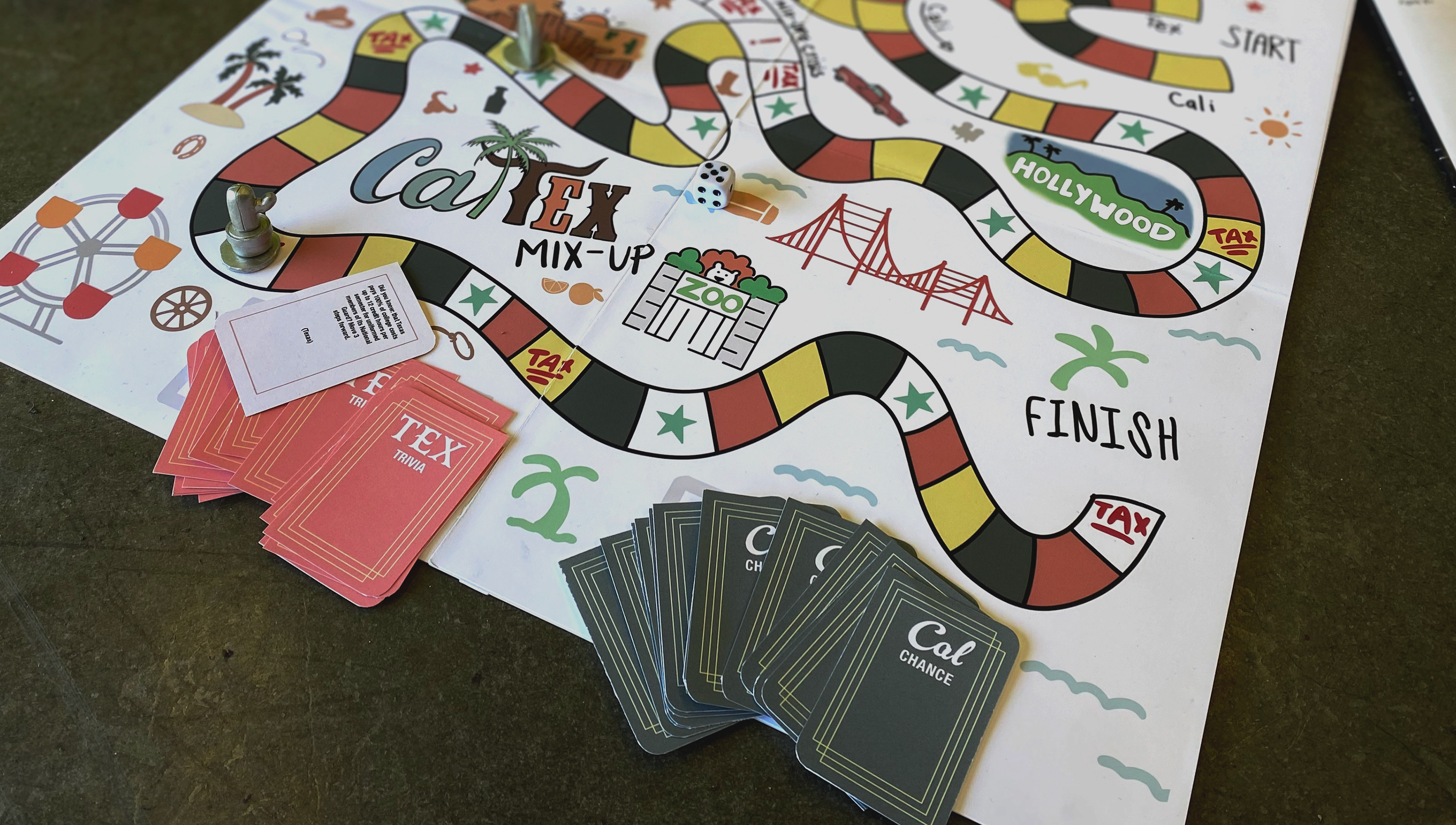
Our game concept is aimed at educating players about the disparities between California and Texas living. Players could opt to start in either state, navigating the gameboard towards the finish line. Along the way, they encountered spaces dictating various actions: drawing trivia or chance cards, paying taxes, receiving salary, relocating, or switching states.

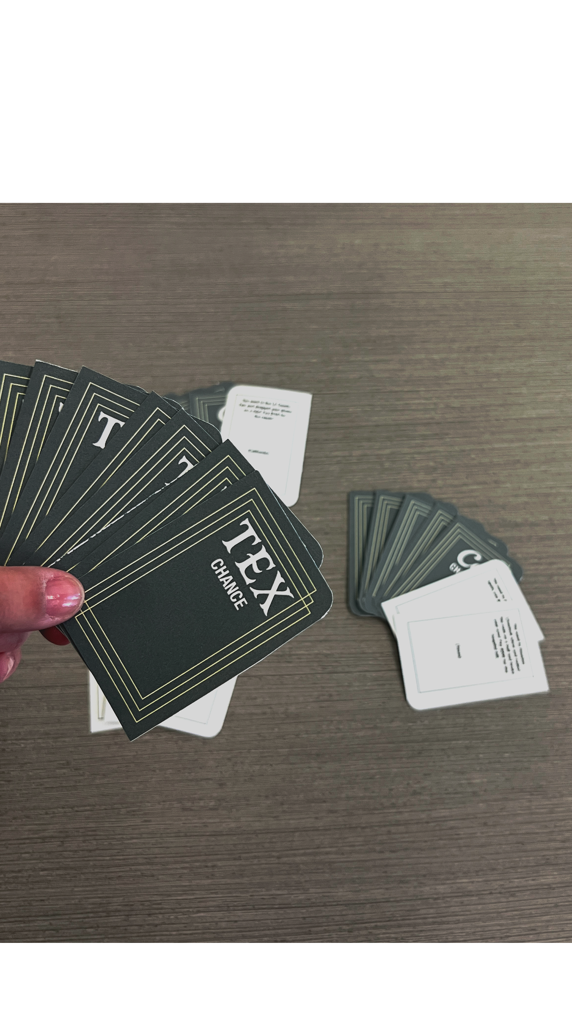
Close-up of the player in the middle of picking up one of the Tex chance cards.
I also helped with creating the first draft of the gameboard instructions. I had written a few of the guidelines on our shared document to help speed up the process and pass it on to another team member to finish and design.
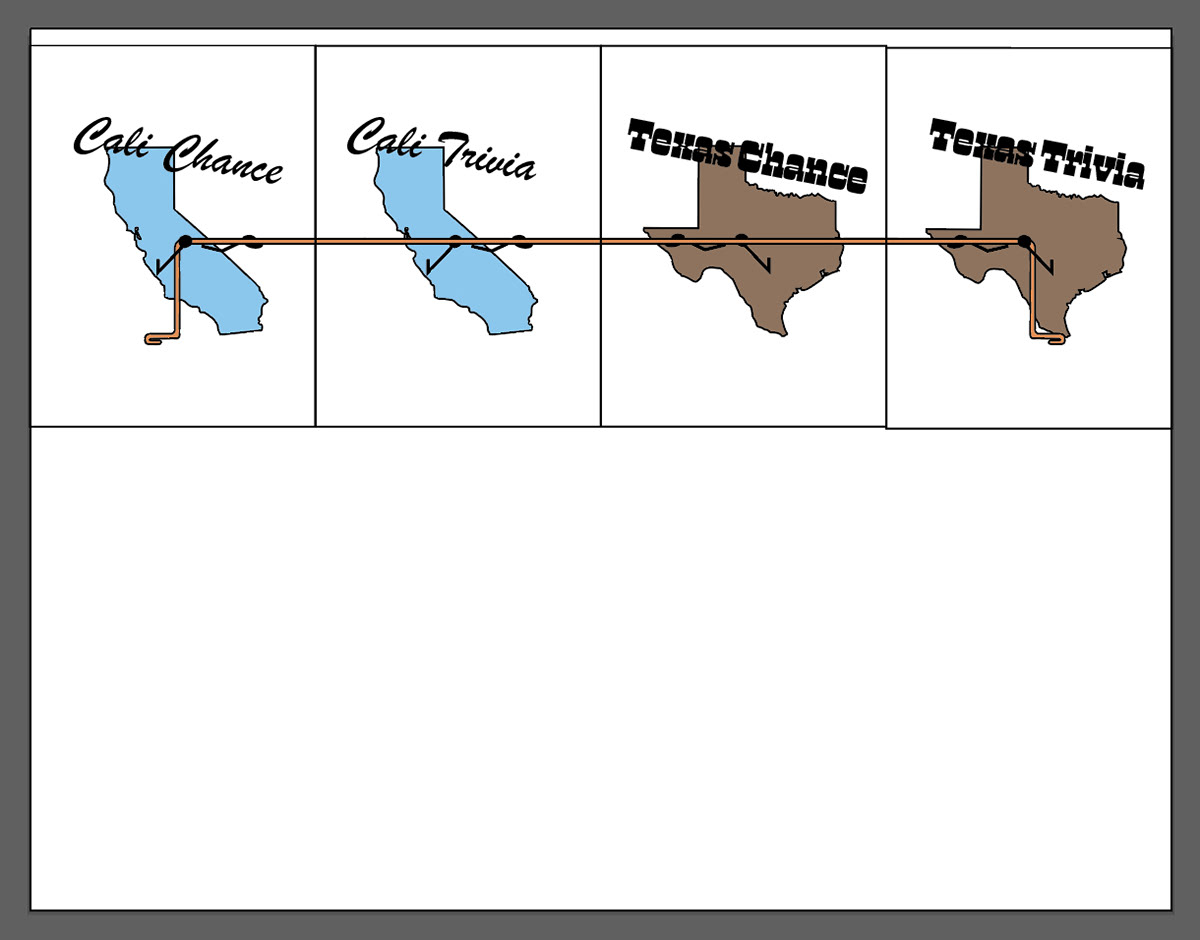
I was tasked with creating the chance and trivia cards, for my part of the project. For my first design, I used the logo design that I created from the image of the states playing tug-o-war with each other. The design I created didn't end up matching everyone else’s style so I ended up throwing out the design and starting new.
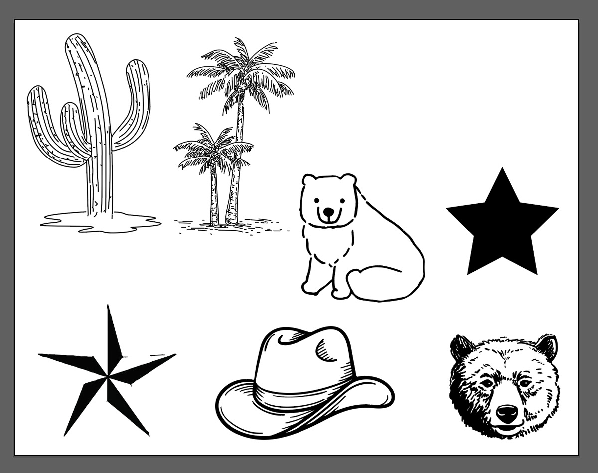
After throwing out the first design, I went and looked at the logo, hero image, and game board that was being created by the other members. I tried to look at and embrace the icons and design style that they were using to give me more inspiration for the covers of the chance and trivia cards. Seeing their first drafts of their work, a lot of their designs had cacti, palm trees, bears, stars, question marks, circles, etc. Honestly, I didn’t know where to start for the card covers, the designs were still being worked on, so I thought that I would wait till they created some fully fleshed-out designs and ended up moving on to start editing the text on the cards.
While working on the text for the cards, I tried to find typefaces that matched the aura of the hand-drawn typeface of the logo. I found some that brought out the aura of each state, with Texas being more of a western block font, Mr Darcy Bold, and California more of a cursive brushstroke font, Gelato Luxe Regular. In my first draft of the text for the cards, I had the whole title in the western and brushstroke font which made them look too busy. In the second draft, I started to figure out when font to use as the secondary typeface that every team member could use. And Helvetica Neue Condensed Bold was a good basic font that fit well in multiple places around the gameboard.
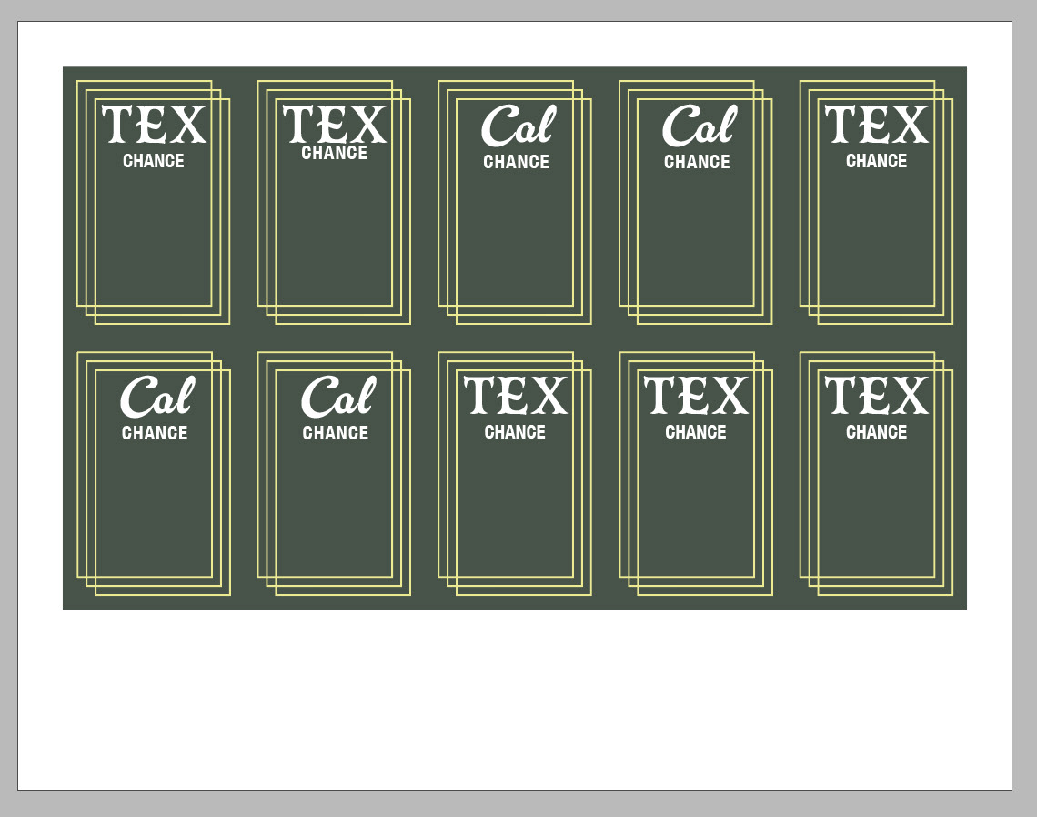
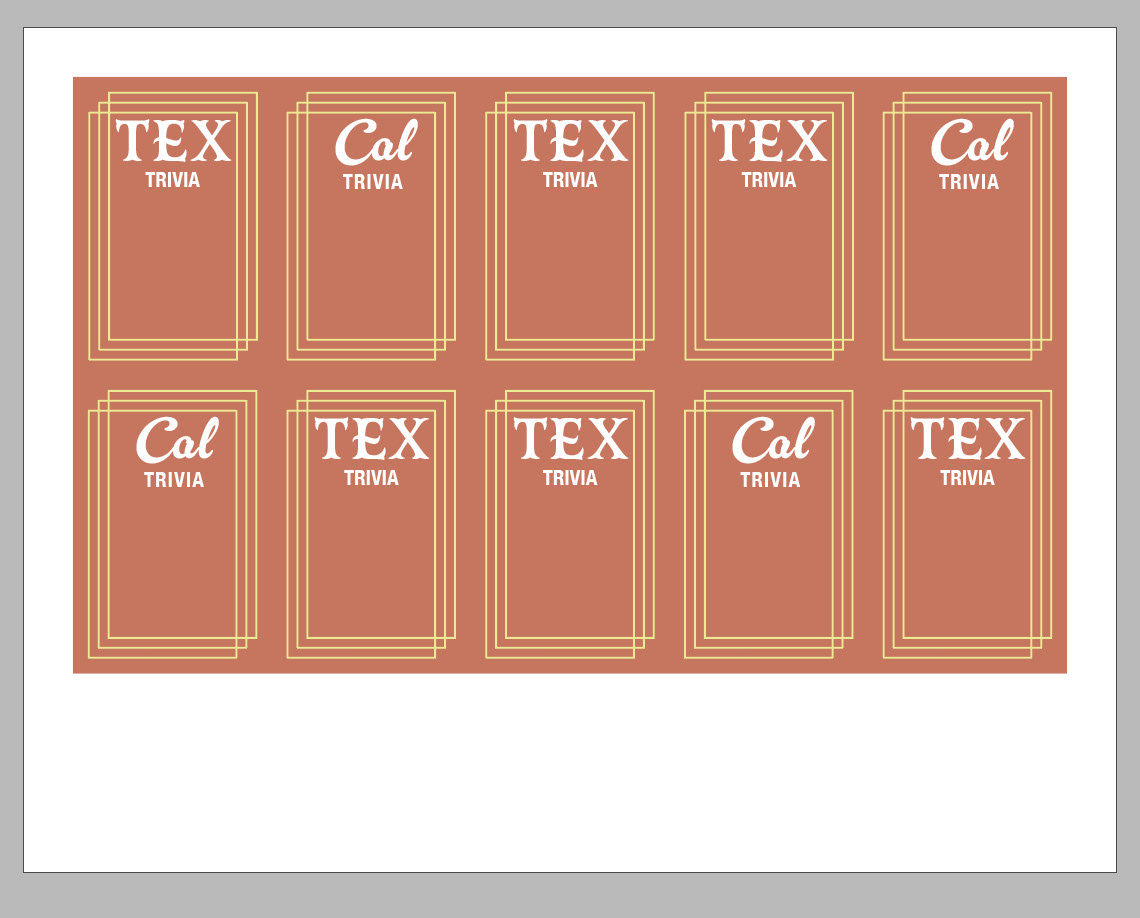
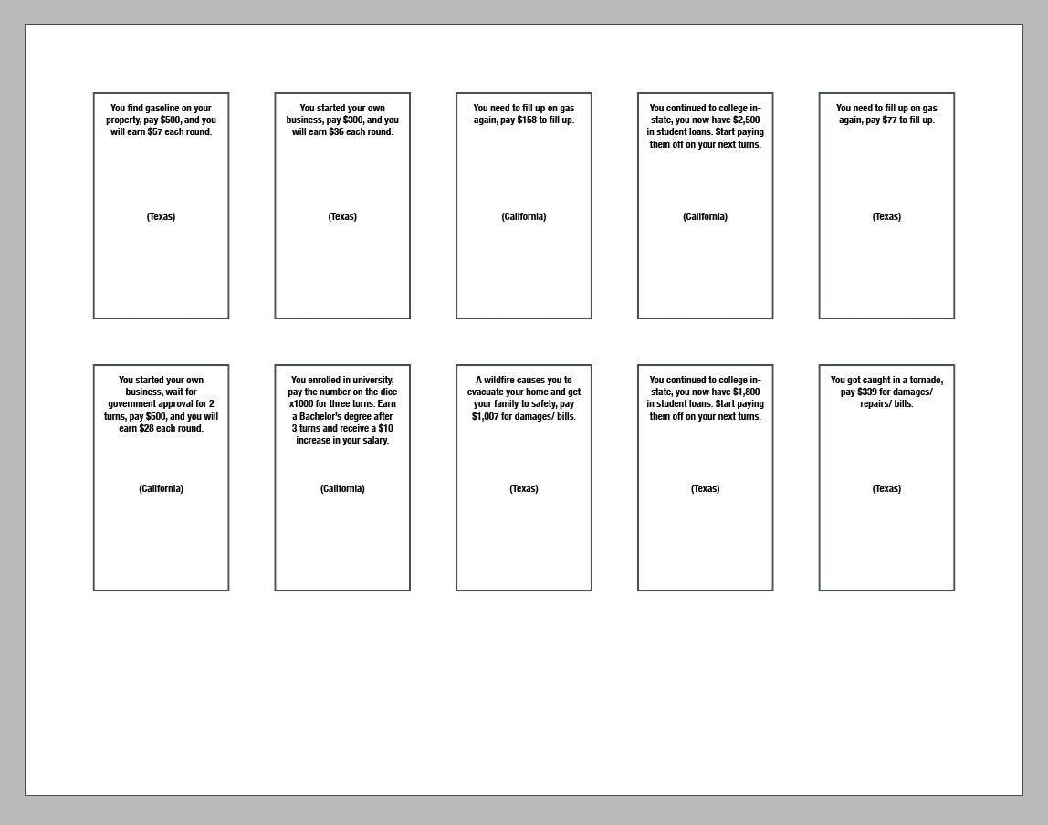
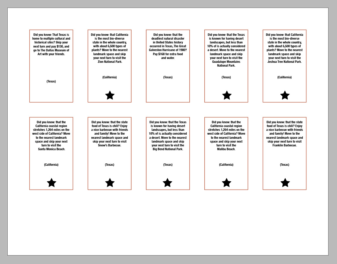
After working on the text portion of the cards, I went to start the front designs again and saw that the other members started to put colors on the logo and gameboard. I still couldn't figure out what icons they were using on the gameboard, because they had designed them on the game spaces and all around the board. So, we ended up needing to talk about these icons on the gameboard spaces. As a team, we ended up deciding to remove the icons that were on the board spaces to make it easier for the player. We ended up using four main colors on the board to make it easier to understand which card was for the specific spaces.
I ended up using the gameboard space colors for the front cover of the card. Instead of trying to be intricate by using icons and images, I designed the cards to be plain colors, that matched with their board spaces, and with a little line design that framed everything together.
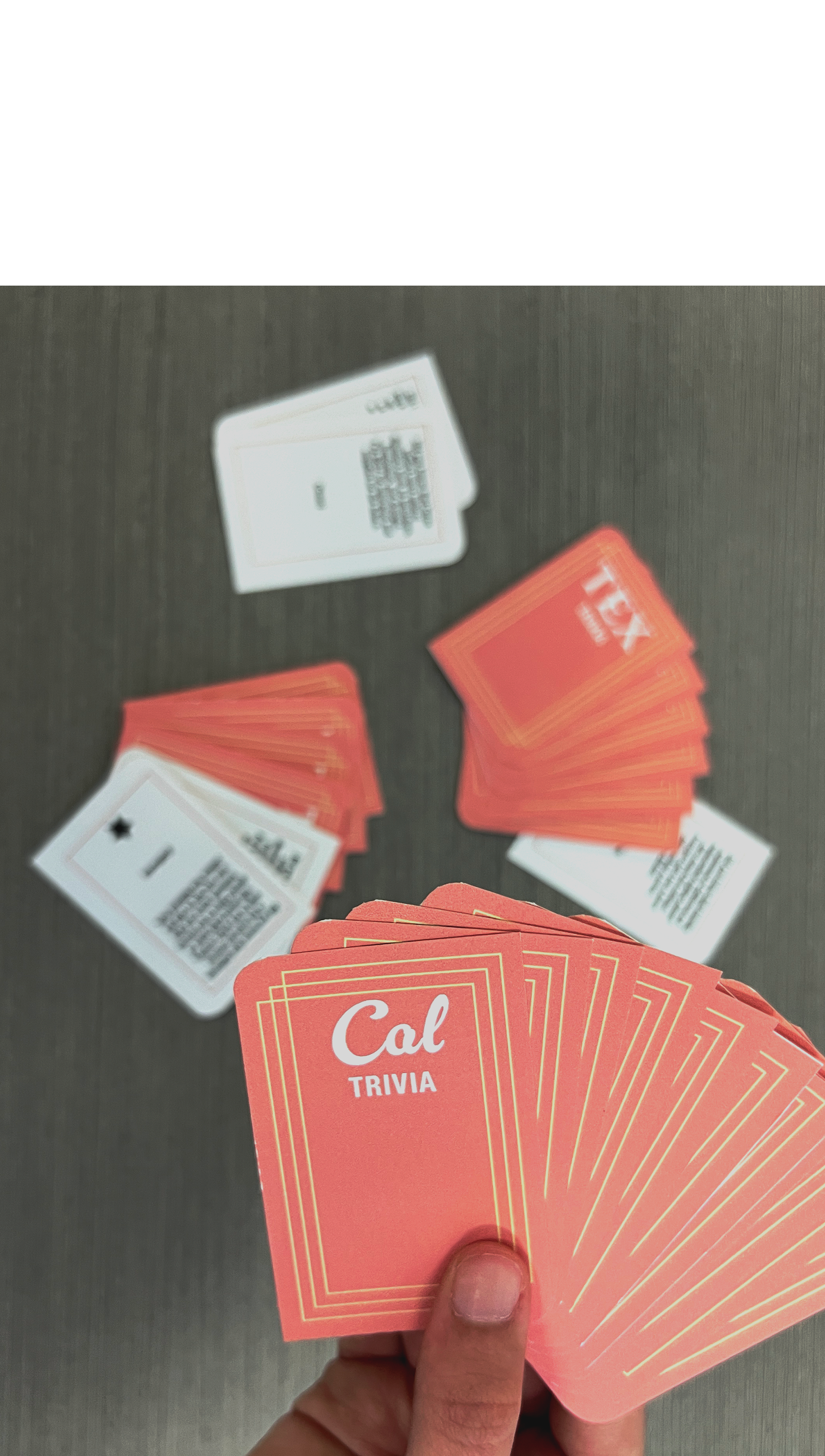
When I took the printed card to our testing day, the cards did not look super great. And that was because I didn’t cut the cards right, which made them become misaligned and messed up. A few of the cards also needed to have the text updated with new amounts of money and space stops. And after printing the cards the rectangle design seemed a little plain, so I ended up rounding the two corners diagonal to each other to create some movement.


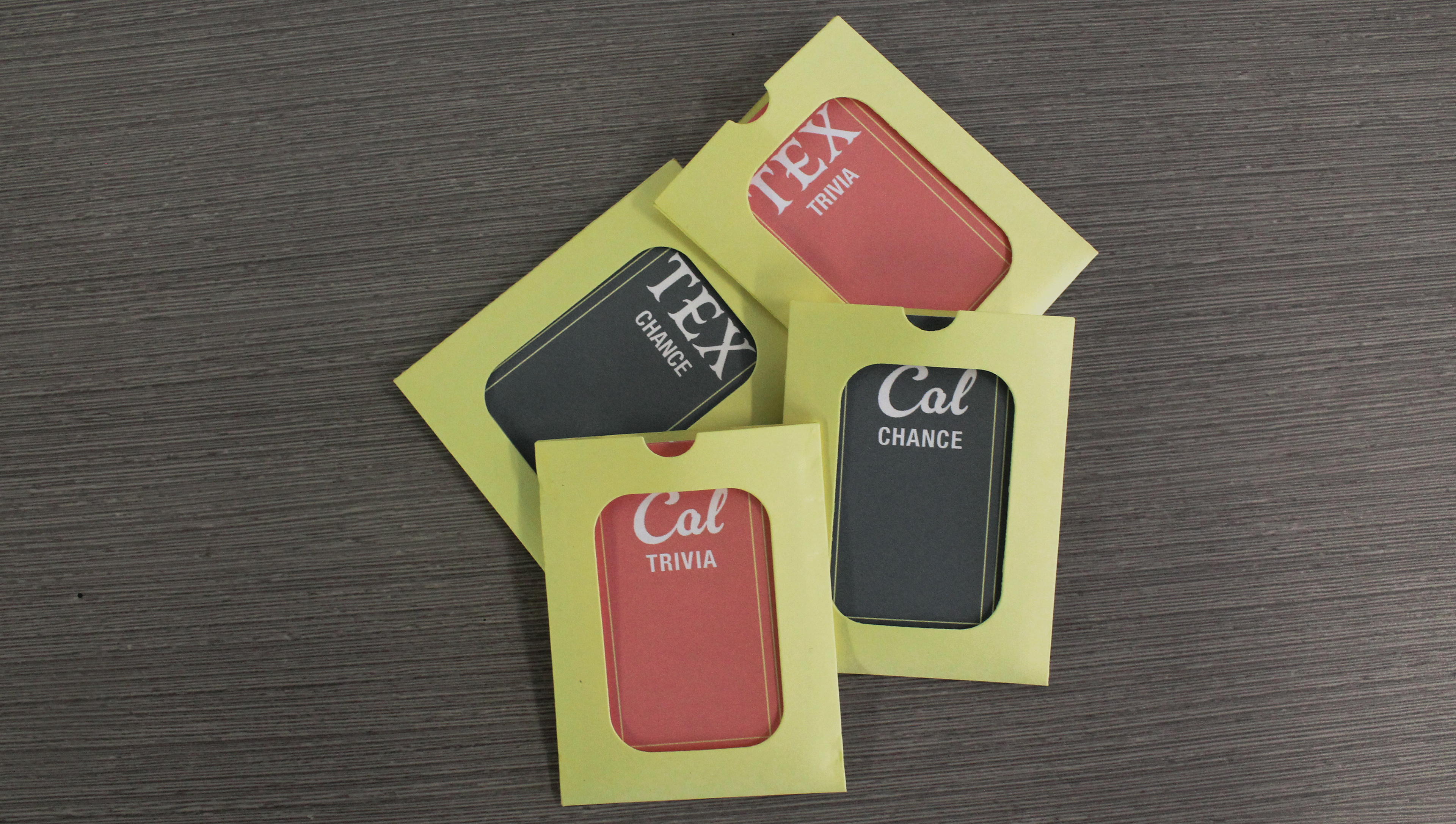
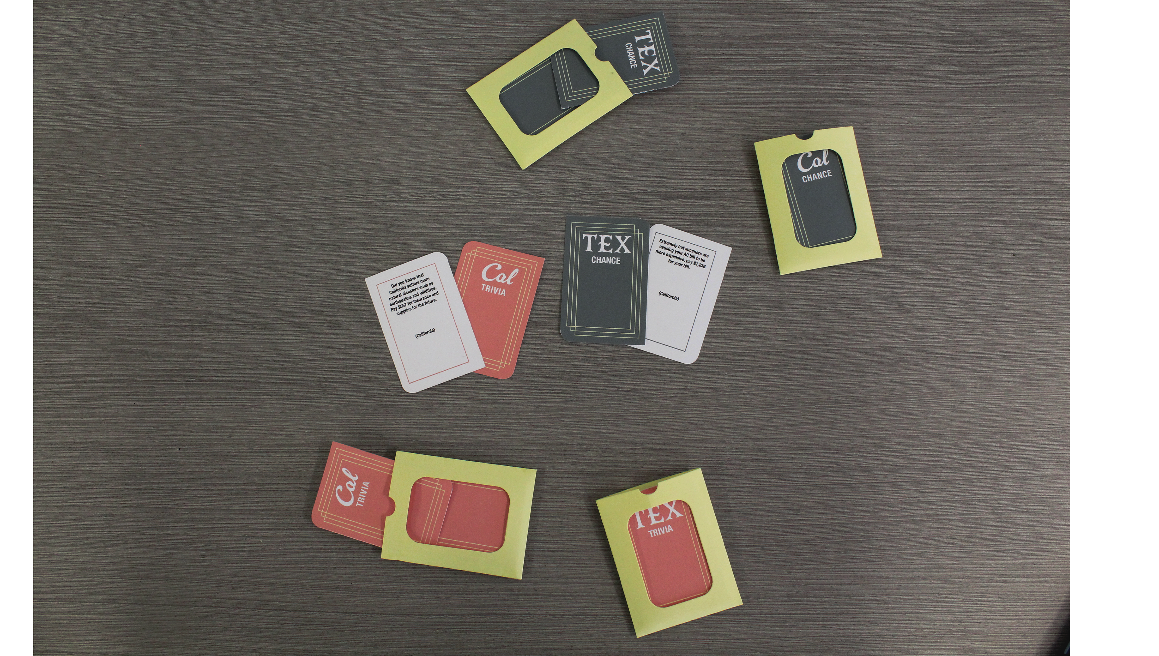
After having printed out the cards, it felt like there were a lot of individual cards and nothing separating or holding them. I wanted some type of cardholder/ envelope for these groups of cards so we could put them into the box afterward. So, I created a little cardholder/ envelope to keep them in. I had cut out two examples to have my team members choose from and we ended up liking the one with the cut out of the front window because you could see the title of the cards which was a nice addition. I ended up cutting out the cardholder/envelopes in a light yellow that matched the gameboard spaces as much as possible. I also cut out extra yellow cardholders for the individual stacks of money.

Close-up of one person explaining the instructions by showing what the game spaces mean.